BECCA ATKINSON
Leading Bank Institution
Email and Landing Page Template Redesign and Optimization
This client is a leading bank for individuals and institutions alike, currently overseeing trillions of dollars in custody assets and managing trillions of dollars in assets. For this project, we were tasked with redesigning email and landing page templates for Marketo in order to maximize efficiency and ensure visual and strategic alignment to the design system we developed for the corporate site.
Role and Scope of Project
I served as lead UX, content strategist and storyteller (aka presentation designer), with a bit of project management because we didn't have clear direction. It was really up to myself and the art director with whom I worked closely to determine next steps at every stage of the project.
Team:
UX designer/content strategist (me)
Art director
The Challenge (according to the client)
The purpose of this project was to redesign email and landing page templates to better align to the design system and increase efficiency for the team building the designs. We were handed:
-
12 email templates
-
~100 email components
-
11 LP templates
-
~75 LP components

While the materials provided to us were extensive, understanding the use case of each component and template was challenging to derive from placeholder text.
The final deliverables would include: updated landing page components and templates, updated email components and templates, and written usage guidelines.
The KPIs we were meant to be tracking against were:
-
Achieve or surpass email benchmark click through rate of 2.7%
-
Decrease time spent building emails/landing pages from ~8-10 hours to 2 hours
The True Challenge (once we began work)
As with most client-service projects, the true challenge differed a bit from the initial brief. Two main challenges we uncovered were:
1) "Real" or "live" examples of emails and landing pages were challenging to get our hands on. It's difficult to redesign a component or template without having context for how it was used today. Eventually, we were able to take a look at some real examples, however they were a huge departure from the templates that the team was meant to be using.
2) Related to this, the marketing teams weren’t writing to the templates, which meant that the new templates we redesigned (and/or created net-new) needed to better accommodate the content that the marketing team wanted to include. They became a third audience we needed to design for, in addition to the Marketo team (who would build/design the emails) and the email recipients, which could be clients of the financial institution, newsletter subscribers, etc.
Design Process
1. Assess Client-Provided Materials
This was very much a “make it up as you go along” type project. First we evaluated their current templates to better understand how each component was being used. We also did some work around email best-practices to ensure we took this as an opportunity to build out their email program.

We made template and component level observations which turned into recommendations as the project progressed.
From here, we were able to make specific recommendations at a template and component level, making observations around what could be killed, consolidated, or tweaked. At this stage, we thought of components as unique items that may have variations. This is how we maintain our own design system, and thought that having an image be on the left or the right, for example, would just be a variation and not its own component.

Here's an example of how we communicated to the client what our plan was at a component level, to reassure them that we weren't simply getting rid of everything.
2. Look at what components in DDL are similar
Next, we looked at our own DDL and pulled in components that either looked similar visually or would offer a similar functionality to what the team was using today. I helped pull in a few options for each existing Marketo component, without making any tweaks.


Some components were pretty far off from our DDL components, while some just needed a slight tweak (like a removal of an eyebrow or a graphical element). For each image, the left column is the provided components, and the right column is the components I found from our DDL that were similar.
3. Provide recommendations for new components
Using everything we had learned so far, in addition to our own DDL components, I took a stab at designing new components to help out the visual design team. Part of this step was also recommending net new components that they weren't using in their Marketo designs today but that we thought might provide value, such as data visualization components and accordions.
During this step, we learned that what we think of as variations for a component (and therefore just part of one component) doesn’t exist in Marketo in the same way. The team explained that it's easy in the tool for them to turn off specific items (like a CTA) or change a background color, but removing an entire text block in a 2-column layout is more challenging and therefore variations like this should be considered their own components.

Redesigning each component was a mix of tweaking our DDL components to accommodate items that the Marketo team needed, as well as removing items from their components to better align to our DDL.
4. Template redesign
Once we had new components, we were able to move on to template redesign. We evaluated each of their existing templates and noticed that some consolidation could happen. For example, they had 4 "Awareness and Engagement" landing page templates, but for no rhyme or reason. We came up with new categories of templates so as to better distinguish one from the next, and to give each a clear use case. We decided to take a minimum and maximum approach to each template category, which they could pick from based on how much content the marketing team required.
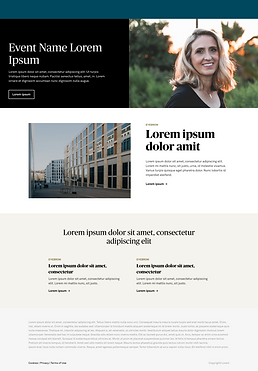

Here is the event template we created, with min (left) and max (right) states. They did not have an event landing page template, so this was a net-new one we created for them because we identified a need for one based on the email templates they provided as well as the real examples they sent.
5. Establish framework for usage guidelines
As part of most of our handoffs, we provide written guidelines for our clients and dev teams to ensure proper strategic use of the designs we have created. For this project, we had to provide guidelines at a component and template level.
I took an initial stab at writing the guidelines for components, and my partner (the art director) made some tweaks based on her extensive knowledge of our design system. Here we mentioned what items could be suppressed, where a component should fall within a page or email, and the type content that the component is meant to accommodate. Part of this step also involved figuring out the best grouping strategy for components, given what we learned about how they are built in Marketo.

These items above could be considered part of the 2-Up component as the only difference between them is a background color.
The bulk of my time in this stage was spent on writing the template guidelines. Here we provided instructions surrounding the order of a page or email, which sections were required or optional, and all the components that the client could choose from when it came to a specific section. We linked each mention of a component to it's place in the component sheet (shown above) for easy reference.

Here is the final template usage guidelines for the Event template, Min state. We created a usage guide for each min and max state for each template. Sections that had a choice component are in pink, whereas sections that only had one component option are in yellow.
Outcomes
Whew this project was really a labor of love. It was a great exercise in learning how to move forward without much direction or instruction. The "constraints" took a bit to uncover, and use cases were not immediately clear. Art director Lindsay Farrell and I had great collaboration the entire way. This project was a great lesson in the art of uncovering the true challenge or problem (as it's not always the first one that's outlined in the brief). We handed all components, templates, and user guidelines in late January 2022, and are waiting to hear about how the time taken and email open rates improve.

The excitement in the final handoff presentation was palpable. (Note: we did not take a shot after handoff as my co-collaborator is pregnant).